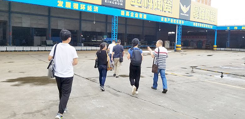
We are currently working on an apartment project that includes interior furnishing. Last month, we recounted our collaboration with a ceramic tile manufacturer based in Foshan, Guangdong. Continuing this partnership, we once again visited their factories to find the right flooring for our residential units - in search of the perfect white!
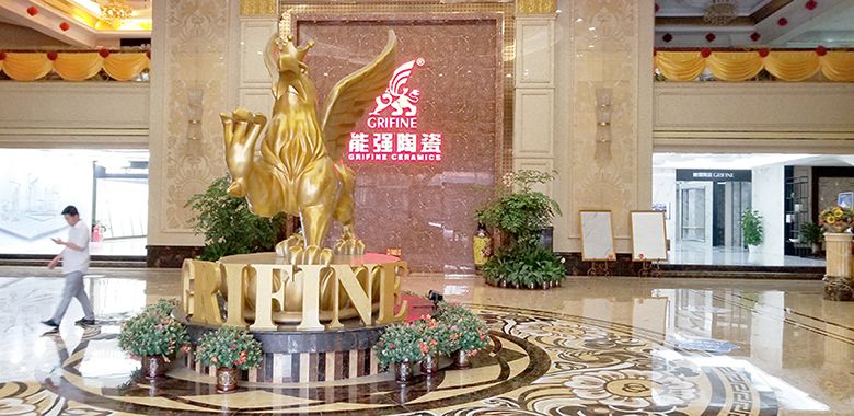
我们事务所正在进行君钰府公寓和住宅的精装修设计,6月份发表过一篇《为达设计效果,我们研制仿大理石瓷砖》。我们再次前往佛山工厂(广东能强陶瓷有限公司),寻找最适合的地砖,研制最完美的“白”!
It is important for architects to confront the reality of their materials, each material's "real-world glow." In our digital age of representation, elegance devolves quickly into kitsch when designers do not fully understand the subtle textures, tones, and underglows of their surfaces.
在一个以数码表现为主的时代,设计师更需要了解材质安装后的真实效果,靠经验来判断不同材料的"真实光辉"。片面的理解纹理、色调等,或许能渲出优雅的效果图,但实施后可能会很庸俗。为追求最终效果,我们项目组在工厂调色监制一整天。
We sent to Foshan the architects who understand intimately each curve, facet, and intersection between wall, window, door, and floor. Those who determined the location of drop-ceilings, if windows slid left-right or up-down, or whether sinks were placed inside bathrooms. Only with that kind of total spatial knowledge can we make the best decisions.
我们设计了每一道墙、每一块天花、每一扇门、每一扇窗,它们之间的交接,窗户左右滑动还是上下滑动,洗脸盆设置在浴室内还是浴室外等等,有了这种对空间的全面理解,才能做出最高层次的决策。
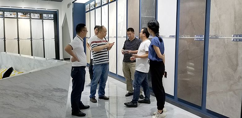
But how to communicate our vision with the manufacturer? "A picture is worth a thousand words," the saying goes. In a factory producing over 35 product series and infinite colour combinations at our disposal, pinpointing the exact pattern in the right tone and finish could be a very long conversation indeed. Luckily, we are Professionals. And Professionals have Their Ways.
如何向厂家表达我们的想法?在一个拥有超过35种产品系列和无限色彩组合的工厂里,如何才能找到最准确的材料色型?幸好,我们是专业人士,有自己专业的方式!
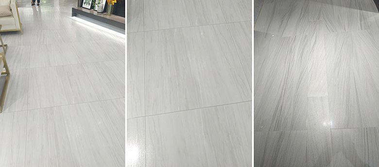
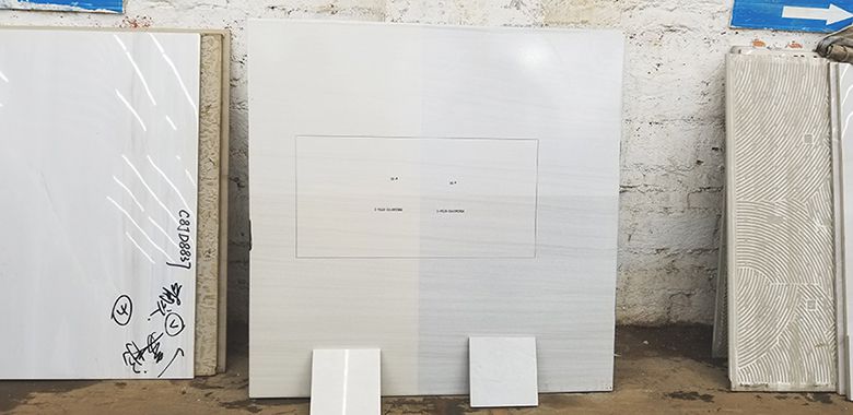
First, we narrowed down two patterns in which we were interested. One of a feathery grain, floating somewhere between folds of chiffon, wenge wood, and layered limestone. The other resembled a sort of loose ashwood.
首先,我们找了两个有启发的样板,一种类似羽毛状颗粒、雪纺、或石灰岩肌理的材质,另一种是比较抽象松散的灰色木材花纹。
The initial thought was that both designs needed to be compressed in scale for a more refined look. In looking at prelaid wall and floor sections, however, we realized that the pattern density was just right for covering larger surfaces. What mattered more was the colour contrast within the pattern - when muted, surfaces appeared more pleasing and less coarse. Too much texture heightened the feeling of being enclosed. As the units themselves were already quite tight, we wanted a greater sense of space.
最初的想法,这两个样板都需要调整,才能产生更精致的纹理,在观察预铺的墙壁和地板部分时,我们发现现有的密度已比较适合大面积使用,更重要的是颜色的对比。对比小一点,花纹更微妙、更舒服,对比大一点,显得空间更拥挤。我们的户型空间不大,需要对比小的。
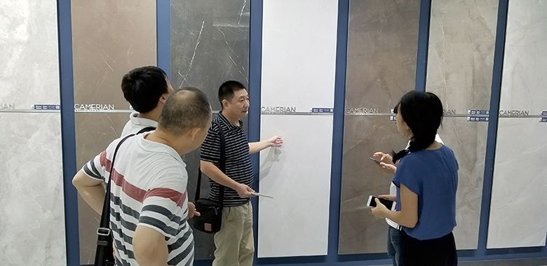
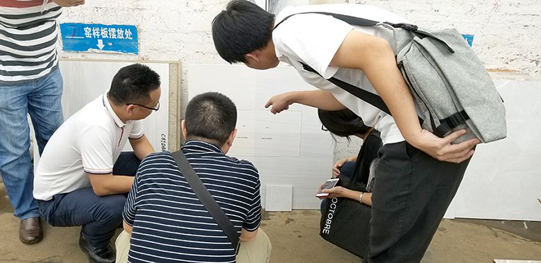
Seeing the showrooms had another major advantage: weeding out patterns that didn’t serve our purpose. What works for a wall may not always work for a floor, and vice versa. Format is also a delicate matter. Square tiles do not always do justice to one design, while others absolutely demand 1:1 dimensions. Finally, the size of each tile is crucial to the overall effect. With these factors in mind, we were left with one standing champion.
在样板间,先淘汰不适合需求的样品。铺在墙面好看的,放在地面不一定好看。形状很重要,正方形和长方形的效果也会不一样。有些花纹只适用一种形状,其每一块的大小也需要精心琢磨。综合考虑,我们挑选了一个能符合要求的花纹材料。
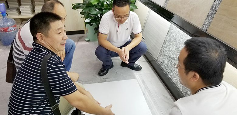
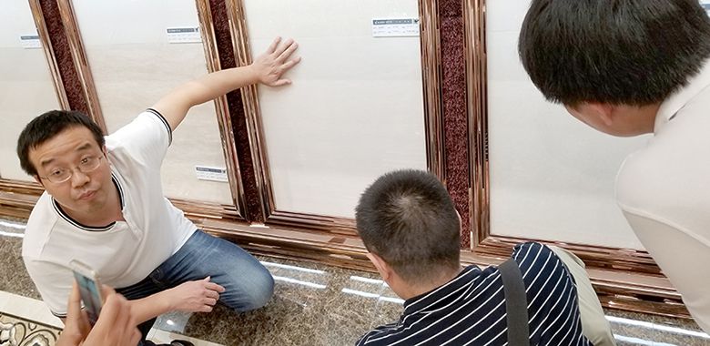
The task was far from over. It is one thing to find a suitable design, another entirely to achieve the right tone and finish. Not only that, but to also ensure that it can accommodate different types of lighting as well as a wide range of furniture and aesthetic styles. We were on a mission to find a very particular shade of white!
战斗还远未结束,最难的考验来了——选色调!需要一种多功能的“白”,能搭配多种家具风格,暖而不混,亮而不冷的白!一种独有的中性白!
We tiptoed around the descriptor, "yellow-ish." This led to some unsuccessful recommendations. Too green, too orange, too yellow... too red, too purplish, too blue... too grey! We could only point at samples and move towards the ultimate goal. Something like this, but not so purple. Like that, but not so dark.
我们挑来挑去,先提到了“黄色”,这导致了一些不成功的建议。不是太绿、太橙、太黄,就是太红、太紫、太灰……什么色调既温暖,而颜色又不那么明显呢?我们只能慢慢的寻找最接近的样板。像这样的,但不要这么紫;像那样的,但要更亮一点。
At one point it struck me, your roving reporter, that perhaps "yellow," had put us on rather a backfoot. We were looking for more of a sandy, nude tone than what most people understand by the adjective "yellow." We wanted an eggshell white, specific tints of which are often finessed by makeup gurus. After all, when it comes to neutrals, they are the queens!
突然,我想到一点,是不是我们用“黄”误导了厂家?误导了我们追求的目标?其实,我们要找的色调更接近沙滩的颜色,并不是大多数人理解的“黄”,而是想要一种“蛋壳白”,是化妆界最百搭的色调——“裸色”!
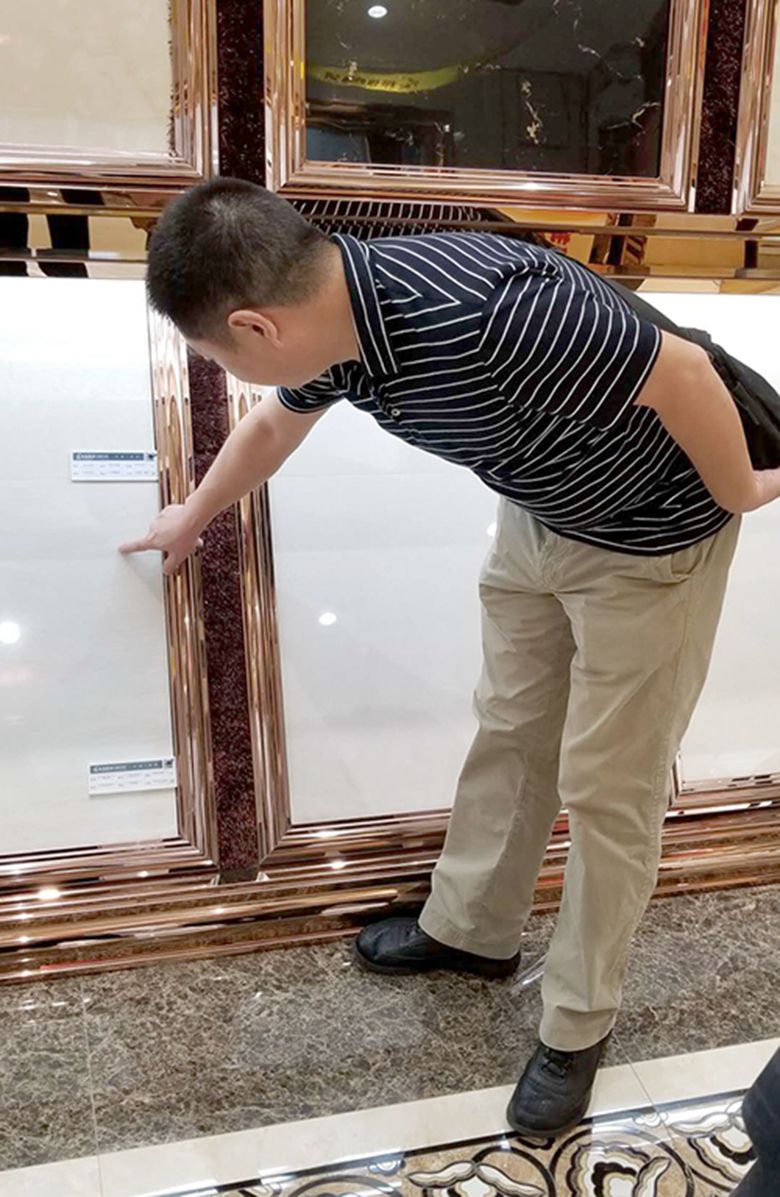
Through long exchange with our manufacturers, we set out a range to prototype. After two and a half hours of tea-drinking with our gracious hosts, we laid hands on our custom-made tile of eight colour variations.
通过与厂家耐心的交流,我们终于定下一个色调范围。两个多小时后,厂家完成了八种色调的地砖样板。
The story doesn't finish here. While we could immediately see which shades were working, the final finish was still missing. Glossiness has a large effect on the reading of each slab, while the finishing process itself may impact the overall tone.
故事到这儿还没有结束,虽然可以立刻看到些舒服的色调,但有一个完成面还没处理。光泽度的处理不仅影响质感,还有可能改变颜色。
As we eagerly await the final samples, X-URBAN hopes that through this journey you have gained some insight into our design process. We put great effort into every decision, beginning with floor tiles. We are proud of our attention to detail, and this episode is only one of the many instances that X-Urban will go the extra mile to combine beauty and function - in real life as well as on paper!
我们期待最后的样板送到深圳。雅本希望通过这次行程,让您能对我们的设计过程有一些了解,分享我们一些看似简单的艺术努力——用心挑选地砖!为我们的细致和专注自豪!希望把图纸上描绘的完美带到大家真实的生活中!
作者:
谢心怡,女,24岁,加拿大华裔,美国圣路易斯华盛顿大学毕业,现就职于深圳雅本建筑设计事务所。